
- Article
- 1 April 2026
What’s New in NVEIL: Dashboards, Timeline, Choregraph and more !
NVEIL has just shipped its most substantial update since the beta launch. Over the past two months, the no-code data visualization platform has added multi-chart dashboards, a timeline system for temporal data, native geographic visualization, image export, and a fully reworked AI feedback engine. The free trial is live at app.nveil.com. Here is everything that is new.
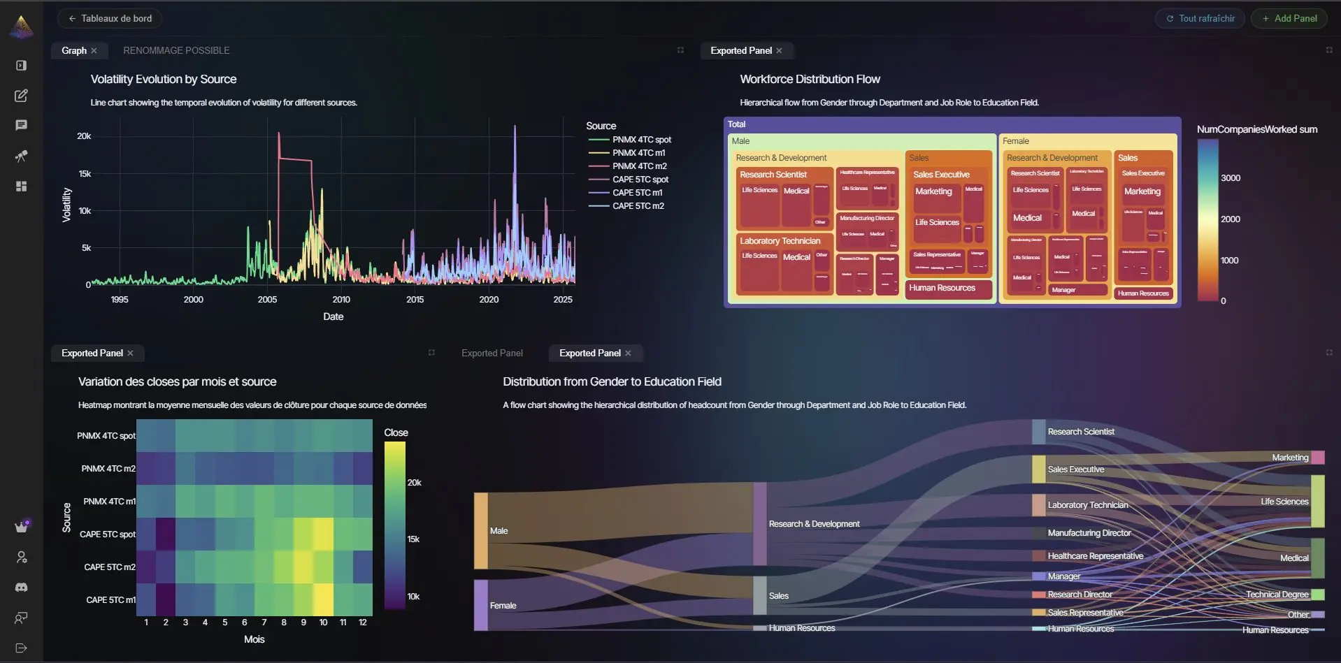
Dashboards: Compose Multiple Charts in One View
The most requested feature since the beta launch is here. NVEIL now lets you compose multiple visualizations into a single dashboard layout. Each panel is independently driven by AI: describe what you want to see, and NVEIL generates the chart, selects the right chart type, and places it in the grid. Panels can be resized, repositioned, and updated at any time without rebuilding the whole view from scratch.
Dashboard provisioning is automatic: once your data is uploaded, NVEIL pre-populates a set of relevant views based on the structure of your dataset. You can keep them, replace them, or add your own. The dashboard button lives directly inside the chat interface, keeping the workflow uninterrupted.
Timeline: Visualizing Data That Changes Over Time
Temporal data has always been one of the harder problems in no-code visualization: most tools either treat time as just another axis or require significant data wrangling before anything useful can be shown. NVEIL now handles it natively.
The new timeline system introduces temporal collections: upload multiple versions of the same dataset at different points in time, and NVEIL tracks them as a single evolving entity. A timeline scrubber lets you step through states, compare snapshots, and observe how distributions, outliers, or geographic patterns shift across time. The underlying upload pipeline is unified, so switching between a static dataset and a temporal one requires no change to your workflow.
Large datasets can also be split into logical partitions (by region, category, or time period), each rendered independently with consistent styling and bounds across the whole set.
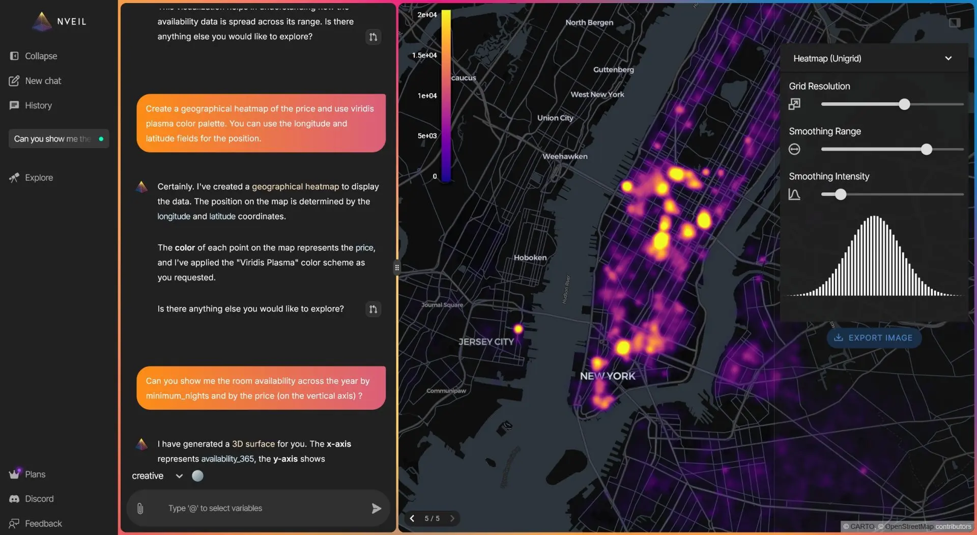
Geographic Visualization: From Coordinates to Choropleth Maps
NVEIL can now read location data directly from your dataset and render it geographically, with no configuration required. Drop in a column of country names, city names, coordinates, or ISO codes and NVEIL resolves them to map geometries automatically using its built-in geocoding layer. The principle that geographic data should be immediately readable without specialist tools is as old as data visualization itself — Florence Nightingale demonstrated it in the 1850s with her polar area diagrams.
Supported output types include choropleth maps (regions colored by a metric), point maps (individual observations plotted by location), and layered combinations of both. The geographic engine handles datasets with hundreds of thousands of points without performance degradation.
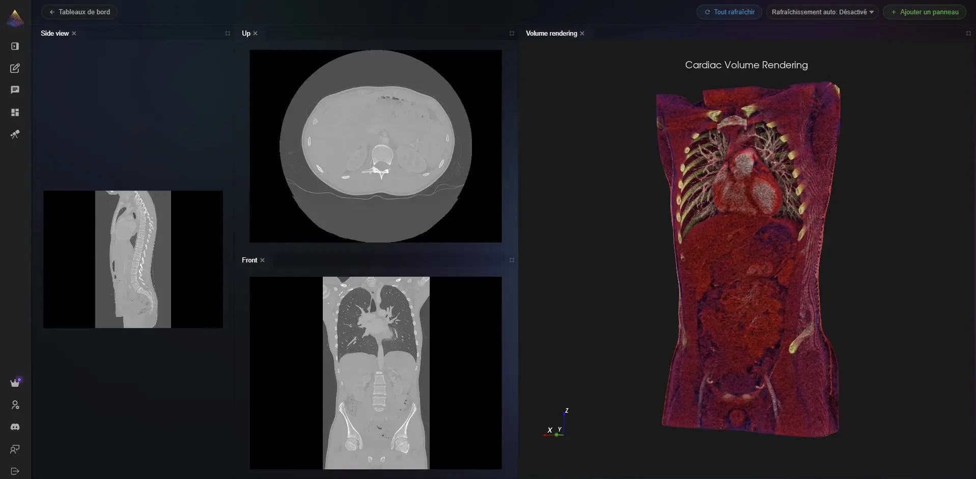
Scientific and Medical Use Cases: 3D Volume Rendering
For scientific and medical datasets, NVEIL now includes a fully reworked 3D volume rendering engine. Medical imaging data, simulation outputs, and volumetric datasets can be loaded and explored in three dimensions directly in the browser, with adjustable clipping planes, transfer functions, and camera controls.
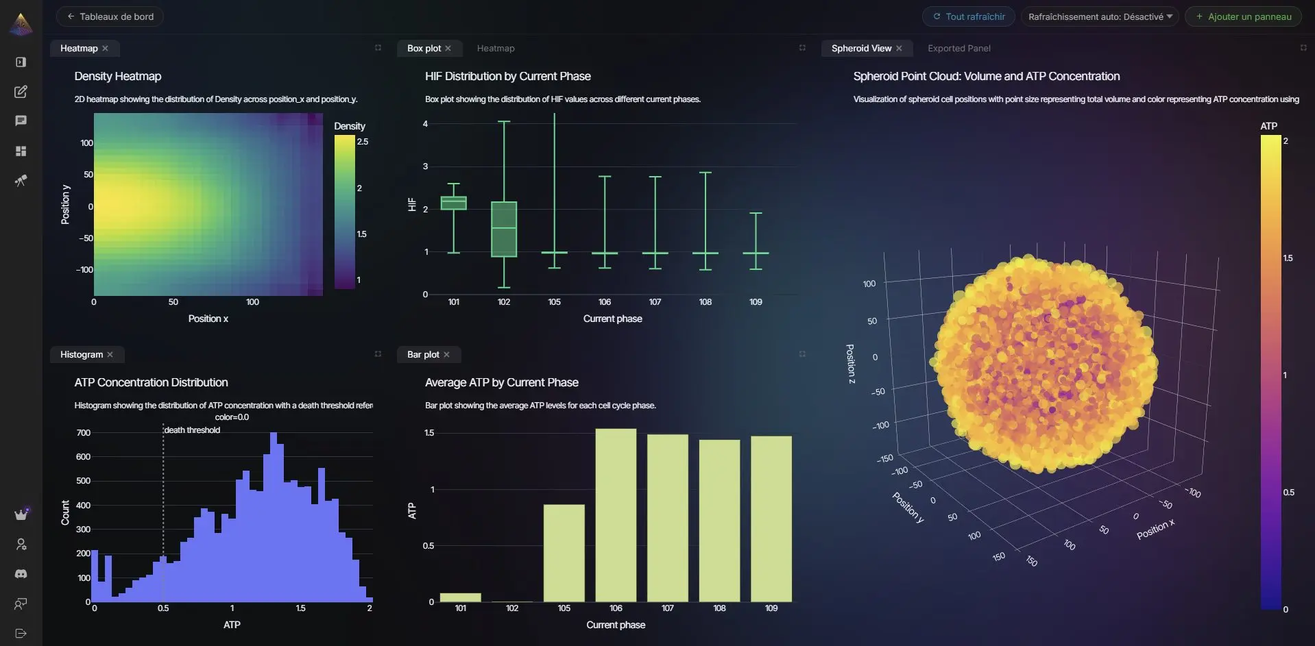
PhysiCell Connector: From Simulation Output to Interactive Chart in One Step
PhysiCell is one of the most widely used open-source platforms for multicellular biological simulation. Its output — a set of .mat binary files and output*.xml metadata files in the MultiCellDS format — is rich but not directly readable by visualization tools. Converting it has historically required R or Python scripts, manual column mapping, and significant domain knowledge.
NVEIL now ships a native PhysiCell connector. Point it at a folder of PhysiCell output snapshots and it handles the rest: it parses the MultiCellDS XML, reads the MATLAB binary files, extracts per-cell data (position, state, phase, custom variables) and microenvironment substrate concentrations, and produces structured CSVs that NVEIL ingests directly. When multiple snapshots are present, the connector auto-detects the temporal sequence and builds a timeline automatically, so you can scrub through the simulation frame by frame inside the NVEIL interface.
This makes NVEIL a practical visualization layer for cell biology and biophysics research workflows, with no intermediate data wrangling required.
Export: Take Your Charts Anywhere
Every visualization generated in NVEIL can now be exported as a high-resolution image. The export pipeline preserves styling, labels, legends, and aspect ratio exactly as rendered on screen. PNG and SVG output are supported, making it straightforward to drop NVEIL-generated charts directly into reports, presentations, or publications without any post-processing.
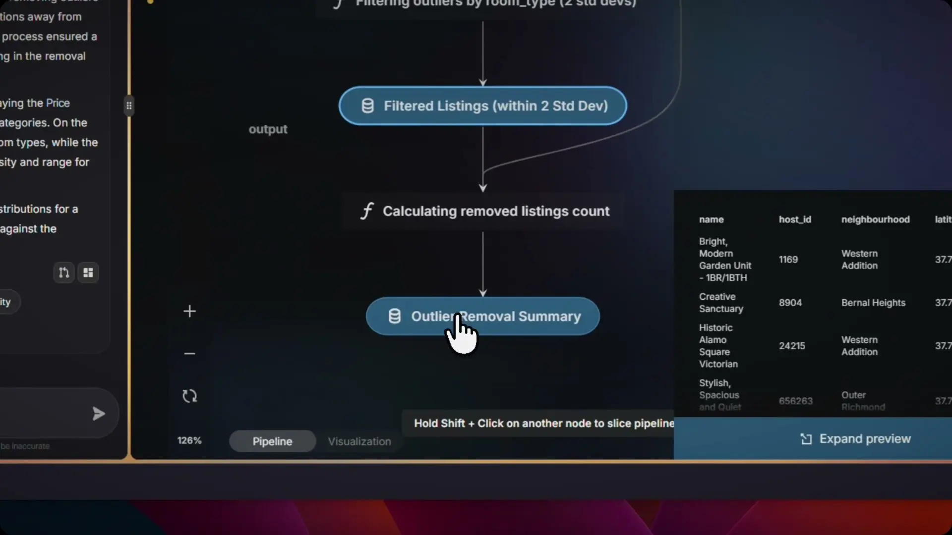
Choregraph: A Data Transformation Pipeline, Built In
Before a dataset can be visualized, it often needs to be reshaped. Columns need aggregating, rows need filtering, locations need geocoding, categories need binarizing. Until now, that work happened outside NVEIL, in a spreadsheet or a Python script, before the data ever reached the platform. Choregraph changes that.
Choregraph is NVEIL's built-in data transformation engine. It sits between your raw data and the visualization layer, letting you define a chain of operations that run automatically every time your data is updated. The pipeline is described declaratively: you specify what transformations you need, Choregraph executes them in the right order, and the result is handed directly to the AI visualization engine.
Available operations include:
- Aggregation: sum, median, count, distinct count — by any grouping column.
- Filtering: row-level and column-level filtering with typed conditions — particularly useful for uncovering patterns that aggregated views conceal, a phenomenon Simpson's Paradox illustrates well.
- Geolocation: resolve country names, city names, or ISO codes to coordinates or map geometries.
- NLP binarization: convert free-text categorical columns into binary indicator variables.
- Partitioning: split a dataset into logical groups that are rendered independently but styled consistently.
- Temporal sequencing: order multiple dataset snapshots into a timeline for playback.
Choregraph pipelines are versioned alongside your workspace. If you update your source data, the pipeline re-runs automatically and the visualization updates to reflect the new state. No manual refresh, no re-uploading transformed files.
SDK: Coming Soon
A Python SDK is on its way. The goal: bring the full NVEIL visualization pipeline directly into your code, your notebooks, and your data workflows, without opening a browser. Early access is being prepared now. Here is a preview of what the API will look like:
If you want early access to the SDK, reach out via the contact page on nveil.com.
AI Engine: Smarter Suggestions, Faster Feedback
The AI engine that drives NVEIL has been substantially improved in this release. Three changes are most visible to end users:
- Persistent visualization memory. The AI now retains the rendering details of the previous chart when generating follow-up suggestions, so feedback like "make the bars wider" or "break this down by category" produces consistent, contextually correct results rather than regenerating from scratch — an important property when small rendering choices change interpretation entirely, as Anscombe's Quartet famously demonstrated.
- Smarter tidying for Excel files. Spreadsheets with irregular headers, merged cells, or multi-row structures are now automatically detected and restructured before visualization. The AI infers the intended table shape and reformats it without user intervention.
- Cleaner feedback loop. The suggestion interface has been simplified so the AI commits to a recommendation more decisively, reducing the back-and-forth required to get to a usable chart.
Infrastructure and Reliability
This release includes a comprehensive infrastructure hardening pass and a major expansion of the automated test suite, which now covers over 300 scenarios across the AI service, visualization engine, and data transformation pipeline. Vulnerability scanning has been integrated directly into the deployment pipeline. The result is a platform that is meaningfully more stable and resilient than the beta.
Licensing: Free Trial, Pro, and Enterprise
NVEIL's subscription system is now fully operational. The free trial gives you access to the complete feature set for a limited period with no credit card required. At the end of the trial, accounts transition to the free tier (with usage limits) or to a paid plan.
- Free: Core AI visualization, limited uploads, PNG export.
- Pro: Unlimited visualizations, dashboards, timeline system, geographic views, SVG export.
- Enterprise: Volume rendering, dedicated infrastructure, custom integrations, SLA.
Frequently Asked Questions
What is NVEIL?
NVEIL is a no-code data visualization platform powered by AI. Upload a dataset in CSV, Excel, JSON, or MHD format, describe what you want to see in plain language, and NVEIL generates interactive charts, dashboards, geographic maps, or 3D visualizations automatically — no programming required.
Does NVEIL require programming skills?
No. The entire platform is designed to work without writing a single line of code. Natural language prompts drive the AI engine, which selects chart types, handles data transformation through Choregraph, and renders the result. A Python SDK is also in development for developers who want to integrate NVEIL into code-based workflows.
What data formats does NVEIL support?
NVEIL accepts CSV, Excel (.xlsx), JSON, and MHD (for medical imaging and volumetric data). The AI engine automatically detects structure, handles irregular headers and merged cells, and restructures data before visualization — no manual cleaning required.
Can I create choropleth maps and geographic visualizations without coding?
Yes. Drop a column of country names, city names, ISO codes, or coordinates into your dataset and NVEIL resolves them to map geometries automatically. Choropleth maps (regions colored by a metric) and point maps (individual observations by location) are both supported with zero configuration.
What is Choregraph?
Choregraph is NVEIL's built-in data transformation pipeline engine. It sits between your raw data and the visualization layer, executing aggregation, filtering, geolocation, NLP binarization, and temporal sequencing operations automatically every time your data updates — so the visualization always reflects the current state of your dataset.
Is there a free trial?
Yes. The free trial gives full access to all NVEIL features with no credit card required. After the trial period, accounts continue on the free tier (with usage limits) or upgrade to a Pro or Enterprise plan at app.nveil.com.
Try It Now
Everything described in this post is live and available today at app.nveil.com. No installation, no setup, no code required to get started. Upload a dataset, describe what you want to see, and NVEIL does the rest.
Questions, feedback, or enterprise inquiries: use the chat inside the app or reach out via the nveil.com contact page.
Ready to unveil your data?
Join hundreds of engineers and researchers who trust NVEIL to turn complex data into actionable insights.
Start for Free