
- Article
- 5 January 2026
The Lady with the Data: How Florence Nightingale Invented Modern Visualization
We all know the myth: The "Lady with the Lamp," gliding through the dark corridors of Scutari Hospital, smoothing the brows of dying soldiers. It is a romantic image. It is also incomplete.
Florence Nightingale’s most powerful weapon was not a lamp, nor a bandage. It was a chart.
I classify Nightingale not just as a nurse, but as one of the founding giants of Applied Statistics. She understood in 1854 what many businesses still struggle with in 2025: Data is not just for storage; it is for persuasion.
Here is the true story of how a Victorian nurse invented modern Data Storytelling to fight a war against bureaucracy—and won.
1. The Origin: The Crisis at Scutari (1854)
When Nightingale arrived in Turkey during the Crimean War, she walked into an apocalypse. Soldiers weren't just dying; they were rotting. The hospital sat on top of a cesspool. The water was contaminated. The ventilation was non-existent.
But the British military administration saw these deaths as inevitable "collateral damage." To them, war meant death.
The problem wasn't just medical; it was informational. The army had records, but they were a chaotic mess. There was no standardized way of recording why a soldier died. One hospital listed a death as "fever," another as "exhaustion." Without clean data, there was no proof that the hospital conditions themselves were the killer.
The "Table Blindness" Problem
Nightingale knew that Queen Victoria and the Members of Parliament were never going to read a 1,000-page report filled with dry tables. She called this "Table Blindness."
In the 19th century, statistics were usually buried in "Blue Books"—dense government reports that gathered dust. Nightingale realized that to save lives, she had to make the statistics jump off the page. She had to turn rows of numbers into a visual shock.
2. The Statistical Crusade: Enter William Farr
Nightingale didn't work alone. She teamed up with William Farr, a pioneering medical statistician and the "founder of the modern concept of surveillance." Together, they standardized the data collection method—the first step of any valid data science project.
They aggregated the numbers and discovered a terrifying truth:
- 16,000 soldiers had died of disease (Cholera, Typhus, Dysentery).
- Only 4,000 had died of battle wounds.
The enemy wasn't the Russian army. It was bad hygiene. But numbers alone were too abstract to convince the Generals.
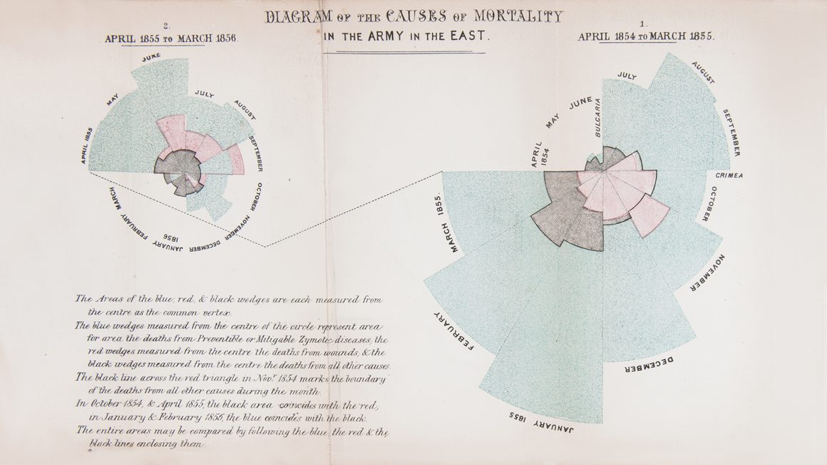
2. The Innovation: The Rose Diagram
To convince the government to send a Sanitary Commission to flush out the sewers and ventilate the wards, Nightingale invented a new visual language: the Polar Area Chart, often called the "Rose Diagram" (or Coxcomb).
Why a "Rose" and not a Bar Chart?
Why did she choose this strange, floral shape? A standard bar chart implies a linear progression. But Nightingale wanted to show the cyclical nature of the seasons and death.
- She divided the circle into 12 wedges (months).
- Crucially, she used the area of the wedge to represent the number of deaths.
The result was undeniable. The "Blue" wedges (Zymotic/Preventable diseases) ballooned outward, dwarfing the "Red" (Wounds) and "Gray" (Other) wedges. It looked like a flower blooming with death.
It was shocking. It was unignorable. She printed these charts in a booklet and sent them not just to the Army, but to Queen Victoria, Prince Albert, and every influential Member of Parliament. It was the first "Viral Data Campaign" in history.
And it worked. The Sanitary Commission was dispatched. They flushed the sewers, ventilated the wards, and cleaned the water. Mortality rates dropped from 42% to 2%.
The Visualization Experiment
Same data, different story. Toggle between Nightingale's 1858 original design and a modern 2025 standard chart.
3. The Critique: The Problem with Polar Charts
While Nightingale’s chart saved lives, from a strict Data Science perspective, it is actually flawed.
If you look at the widget above and toggle to "The Trend," you will see the same data plotted linearly. Notice how much easier it is to read the exact peaks and valleys in the line chart?
This highlights a major controversy in data visualization: The Area Bias.
The Radius vs. Area Trap
In a Polar Area chart, the data value determines the radius of the wedge. However, the human eye sees the area.
- If you double the radius, the area doesn't double—it quadruples
- This creates a visual distortion. The large wedges in Nightingale's chart look exponentially worse than the small wedges, exaggerating the difference between the data points.
Bias as a Feature, Not a Bug
Did Nightingale make a mistake? Likely not. She was a mathematician; she understood the geometry.
She deliberately chose a visualization that distorted the scale to create an emotional impact. She wasn't trying to be "factual" in the academic sense; she was trying to stop a massacre. She needed the "Blue" area to look terrifyingly large to shake the bureaucracy out of its stupor.
5. The Lesson: Context is King
Fast forward to the modern boardroom. We have replaced the quill and ink with Excel, Tableau, and BI dashboards, but we often forget the nuance of Nightingale's choice.
Today, data analysts are often taught to avoid Polar Charts, Pie Charts, and Donuts because they are hard for the human brain to read accurately. We prefer Bar Charts and Line Charts because they allow for precise comparison of length and position.
However, Nightingale’s legacy teaches us that precision is not always the only goal.
- For Analysis: Use linear charts (Line, Bar, Scatter). You need to see the truth without distortion.
- For Persuasion: Sometimes, you need a visual metaphor. Nightingale needed a "Hammer" to break the wall of indifference, and the Rose Diagram was that hammer.
The danger lies in confusing the two. If Nightingale had used a Line Chart, it might have been more "accurate," but it might have been ignored. If a modern financial analyst uses a Rose Diagram to show quarterly earnings, they are likely hiding bad data behind a distorted visual.
Conclusion
Florence Nightingale did not just improve hospitals; she proved that visualized data saves lives. She transformed statistics from a dry science of recording the past into an active tool for shaping the future.
Her story is a reminder that data storytelling is a balance between mathematical truth and human impact. The best analysts know when to use the microscope of a line chart, and when—very rarely—to use the megaphone of a rose.
At Nveil, we believe every data analyst is a descendant of the Lady with the Lamp. We just traded the lamp for a GPU.
Ready to unveil your data?
Join hundreds of engineers and researchers who trust NVEIL to turn complex data into actionable insights.
Start for Free