What is data visualization ?
In a world overflowing with data, interpreting vast datasets is a challenge. This is where data visualization becomes crucial. Data visualization transforms raw data into graphical formats, making complex information more accessible and comprehensible. While traditionally focused on 2D representations like charts and graphs, data visualization is expanding into the realm of 3D, enabling more immersive and interactive ways to explore data.
The Power of Visual Representation
“The greatest value of a picture is when it forces us to notice what we never expected to see.” - John Tukey, 1977
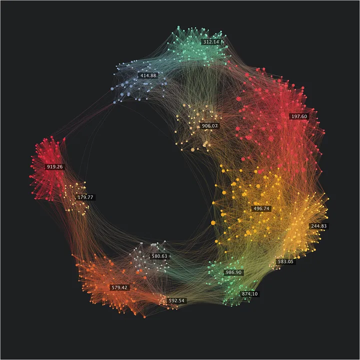
Data visualization isn’t just about presenting data—it’s about unlocking insights that may remain hidden in raw datasets. By visualizing data, patterns, correlations, and outliers become more evident. This is critical in scientific research, where data often spans millions of variables or measurements. For industries dealing with simulation models, complex physical phenomena, or AI training datasets, 3D data visualization offers a powerful tool to explore, interpret, and validate results.
In scientific fields, visualization is essential. For example, climate scientists use visualizations to model and simulate environmental changes, and engineers rely on it to assess the performance of systems or machinery. These visual tools allow researchers to communicate findings clearly and to explore scenarios dynamically, especially as we move toward more complex, multidimensional data representations.
The Pitfall of Pure Metrics: Seeing Without Insight
In today’s data-centric environment, there’s a temptation to focus on key metrics, dashboards, or numerical outputs without considering their context. While numbers might give you the "what," they often fall short in delivering the "why" or the "how." This is where visualization steps in.
Take, for example, a company that tracks its revenue growth using a simple table of numbers. While the numbers might show consistent growth, a time-series line chart could reveal seasonal spikes or drops, helping the team understand trends over time. A heatmap might further identify which specific products or regions are contributing the most to those changes.
More dangerously, ignoring visual cues can lead to overlooking outliers or anomalies that are critical. One well-known example of this is the Challenger Space Shuttle disaster. Engineers were presented with raw data about O-ring failures, but the data was not visualized in a way that clearly showed how lower temperatures correlated with higher failure rates. As Edward Tufte suggested, had the data been presented in a clearer, more insightful visual format, the risks could have been more apparent, possibly leading to different decisions and outcomes.
Similarly, in healthcare, when analyzing patient outcomes, focusing solely on mortality rates might hide underlying issues like unequal access to care or post-surgical complications. A good visualization, such as a bubble chart combining survival rates with geographic data, can uncover patterns that wouldn’t be obvious from tables of numbers alone.
Why Good Visualization Avoids Errors
The power of visualization lies in its ability to make data more intuitive and reduce the cognitive load of interpreting numbers. In fact, good visualizations can prevent costly errors. Consider AI training for self-driving cars. A simple metric like "object detection accuracy" might suggest that the AI is functioning well, but visualizing how the AI perceives objects in 3D space can uncover critical flaws—like misidentifying pedestrians in certain lighting conditions. By visualizing what the AI "sees" as it processes its environment, developers can refine the model and avoid catastrophic failures. In clinical trials, data visualization is critical for identifying patterns that could be masked in tables or raw data. A well-designed scatter plot can help reveal side effects that might cluster around a particular demographic, while a 3D model can illustrate how different treatment doses affect patients over time.
Expanding to 3D with a focus on interactions
As datasets become more complex, visualizing them in 3D, when it is relevant, is no longer a luxury—it's a necessity. In scientific research, engineering, and AI, 3D models provide an immersive way to understand and manipulate data.
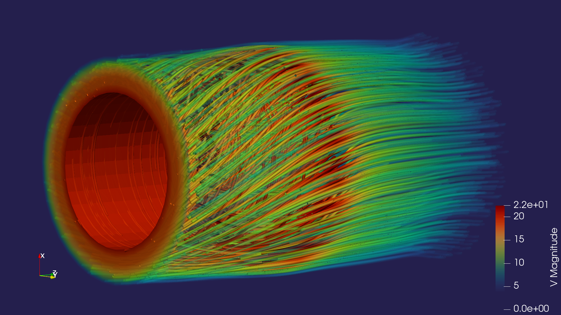
In fields like physics and biology, visualizing data in three dimensions is critical. Take, for example, fluid dynamics. Engineers can simulate airflow over a car or airplane using 3D data visualization, helping them understand turbulent areas or pressure points in ways that 2D charts couldn’t reveal. This insight allows for optimization of design and performance, reducing error and improving safety.
For artificial intelligence, especially in computer vision or robotics, visualizing how AI processes spatial information is essential. As AI models are trained on more complex, three-dimensional datasets, 3D visualizations can help researchers understand the relationships the model is learning, identify weak points, and make adjustments to improve accuracy.
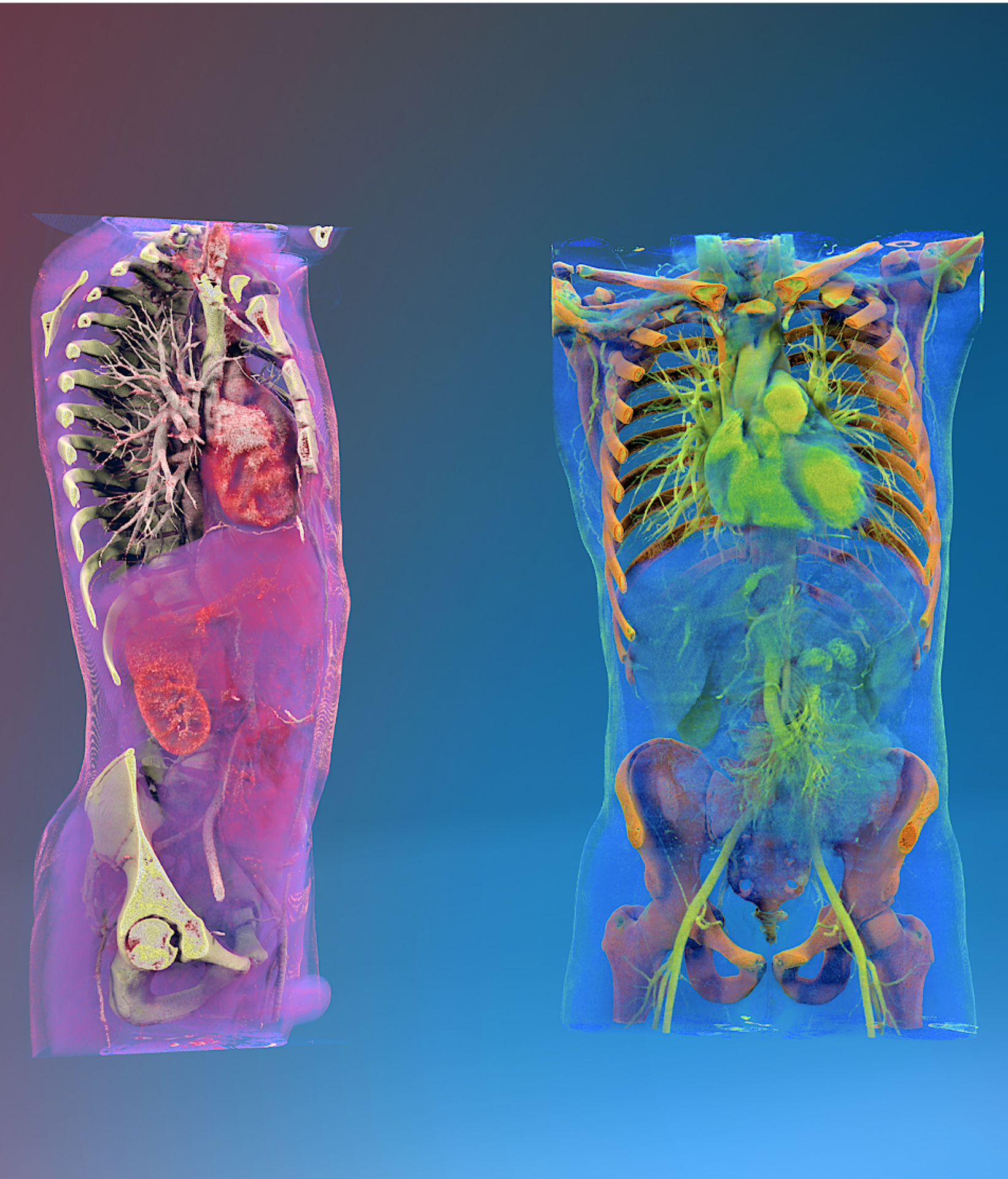
In medicine, doctors use 3D visualizations to examine volumetric scans of the body, such as MRIs and CT scans. These visualizations provide a far more detailed picture than flat images, allowing for better diagnostics and treatment planning. Additionally, digital twins—virtual models of real-world systems—are transforming fields like industrial engineering and healthcare, enabling dynamic, real-time interaction with 3D data.
Benefits of Expanding into 3D
- Enhanced Exploration of Complex Data
As datasets grow in size and complexity, particularly in scientific fields, 2D visualizations are often insufficient. 3D representations provide a more intuitive way to explore intricate relationships in the data. For instance, researchers studying molecular dynamics or industrial engineers analyzing stress on 3D-printed materials benefit from being able to interact with the data in multiple dimensions. - Immersive Data Interaction
Moving beyond static charts, 3D visualizations allow for real-time manipulation. In virtual reality (VR) or mixed reality environments, scientists can walk through molecular models or simulated environments. This immersion enhances comprehension and fosters deeper engagement with the data, leading to new discoveries. - Multidimensional Data Analysis
Complex systems, especially in AI or physics, often involve more than just two variables. 3D visualizations make it possible to incorporate time, depth, or other dimensions into the analysis. This becomes critical when working with high-dimensional datasets, such as those used in AI training for object recognition in robotics. Sometimes it allows to delay the use of dimension reduction techniques like a PCA - Better Communication of Results
Visual representations of data help scientists and engineers communicate findings to a broader audience, whether they are colleagues, stakeholders, or the public. 3D data visualizations, when done right, provide a compelling and clear way to illustrate phenomena, making complex concepts easier to grasp.
Unlocking Advanced Data Visualization with NVEIL
As the landscape of data visualization evolves, so does the need for innovative tools that can keep pace with complex datasets.
This is where NVEIL steps in. Our software empowers users to create intricate visual representations of their data quickly and without the need for programming expertise.
NVEIL is built on a foundation of rigorous scientific research and engineering principles, ensuring precision and reliability in every visualization. Our advanced algorithms leverage generative AI to analyze your data, providing not just visuals, but insights that are grounded in accuracy. Whether you're working with simulations, medical imaging, or extensive 3D datasets, NVEIL transforms your data into clear and meaningful narratives that meet the highest standards of scientific precision.
NVEIL helps professionals make informed decisions. Our software facilitates dynamic interaction with your designs and enables collaboration on holographic representations of critical data, ensuring that you not only see but truly understand the implications of your data. Supported by years of research from institutions like TIMC Lab and Université Grenoble Alpes, we are committed to helping you visualize data like never before, with the accuracy and reliability that your industry demands. If you're ready to elevate your data visualization experience and trust in a tool designed for the complexities of your field, come explore what NVEIL can do for you.
Let's unlock the potential of your data together!
