
- Article
- 31 March 2026
The Histogram: From Pearson’s Evolution to Modern Density
In the field of Exploratory Data Analysis (EDA), the Histogram is a fundamental instrument. It is often the first visualization an analyst generates to understand the distribution of a dataset. However, its ubiquity often leads to a lack of scrutiny. Because the histogram is so familiar, we rarely question the parameters that define it.
Unlike visualizations of absolute values (like a Balance Sheet), a histogram is a statistical model—an estimation of reality. It requires the analyst to make choices about discretization that can fundamentally alter the interpretation of the data.
To understand the utility and the limitations of this tool, we must examine its origins in the Victorian scientific community and how modern computational statistics offers refined methods for analyzing distribution.
Fundamental Distinction: Discrete vs. Continuous Data
Before examining the history, it is necessary to address a common classification error in business intelligence: the conflation of the Histogram with the Bar Chart. While visually similar, they represent fundamentally different mathematical concepts.
- The Bar Chart visualizes Discrete Data (Categorical).
- Examples: Revenue by Region, Headcount by Department.
- Structure: The bars are separated by gaps. This separation is semantic: "North America" and "Europe" are distinct entities; there is no continuous transition between them.
- The Histogram visualizes Continuous Data (Quantitative).
- Examples: Latency in milliseconds, Customer Age, Probability distributions.
- Structure: The bars are adjacent (touching). This signifies continuity. The variable flows seamlessly from one value to the next. The "bin" is an artificial construct imposed on this continuous stream to make it measurable.
Treating continuous data as categorical (or vice versa) leads to errors in analysis. A histogram attempts to approximate the underlying Probability Density Function (PDF) of a continuous variable.
The Historical Context: Karl Pearson (1895)
The concept of the histogram emerged from the biological sciences rather than economics. In 1895, Karl Pearson, a founding figure in the field of mathematical statistics, was investigating the mathematical theory of evolution.
The prevailing methods of the time were suited for discrete categories. However, Pearson was analyzing biological traits—such as the carapace width of crabs or human stature—which exhibit continuous variation. To visualize the frequency distribution of these traits, Pearson required a method that could represent "frequency as area."
In his Contributions to the Mathematical Theory of Evolution, Pearson introduced the term "Histogram". His innovation shifted the analytical focus from individual observations to the shape of the population. This was a critical step in the development of statistical modeling, allowing scientists to compare empirical data against theoretical distributions (such as the Gaussian distribution).
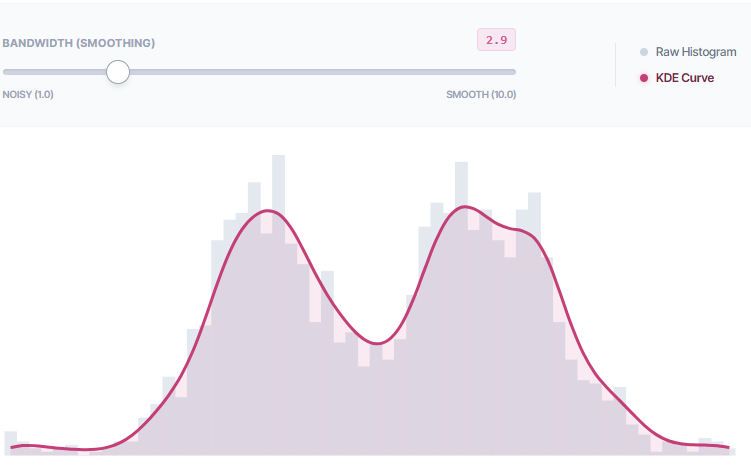
The Binning Trap Interactive The "Binning Trap" Experiment
This chart contains 2,000 data points. The distribution is "Bimodal" (two peaks), but hidden by noise. Adjust the slider to find the density that reveals the two distinct groups.
The Analytical Challenge: The Modifiable Areal Unit Problem
While the histogram is a powerful tool, it suffers from a significant limitation known in spatial statistics as the Modifiable Areal Unit Problem (MAUP). In the context of histograms, this is often referred to as "Binning Bias."
To construct a histogram, the continuous range of data must be divided into intervals (bins). The choice of bin width is a parameter controlled by the analyst (or more commonly, by the default software settings).
This choice involves a trade-off between Bias and Variance:
- Oversmoothing (High Bias): Large bins average out the data. While this reduces noise, it can obscure significant features, such as multimodality (the presence of two or more distinct peaks in the distribution).
- Undersmoothing (High Variance): Small bins capture every local fluctuation. This often results in a jagged appearance where random statistical noise is indistinguishable from actual signal.
Most Business Intelligence software relies on heuristics like Sturges' Rule (formulated in 1926) to determine default bin counts. While effective for small, normal datasets, these heuristics often fail with large, complex, or skewed datasets common in modern analytics.
Modern Refinement: Kernel Density Estimation (KDE)
Pearson's histogram was a discrete approximation of a continuous curve. With modern computational power, we can estimate that curve directly using Kernel Density Estimation (KDE).
KDE is a non-parametric way to estimate the probability density function of a random variable. Instead of placing data points into rigid bins, KDE centers a smooth curve (a "kernel," typically Gaussian) over each data point and sums them to produce a continuous density estimate.
Advantages of KDE
- Continuity: KDE produces a smooth curve that better reflects the continuous nature of variables like time or financial figures, avoiding the "step function" artifact of histograms.
- Structure Detection: KDE is often more sensitive to the underlying structure of the data, such as subtle multimodality, which might be masked by the arbitrary boundary of a bin in a standard histogram.
The Importance of Parameter Selection
It is crucial to note that KDE is not a replacement for the histogram, nor is it immune to parameter selection. Just as the histogram depends on bin width, KDE depends on bandwidth.
- A bandwidth that is too large will oversmooth the data.
- A bandwidth that is too small will undersmooth the data.
Therefore, KDE should not be viewed as a "correction" of the histogram, but as a complementary method. The most rigorous analysis often overlays the KDE curve on top of a density-normalized histogram. This allows the analyst to see both the raw, discretized count (the histogram) and the estimated probability density (the KDE), providing a complete view of the data's distribution.
The Solution: KDE Overlay
This uses the exact same dataset (2,000 overlapping points). Instead of bins, we overlay a "Kernel Density" curve (Pink). Adjust the Bandwidth to smooth the curve. Notice how much easier it is to see the double peak.
Conclusion
The histogram remains a vital tool in the data scientist's arsenal, unchanged in principle since Pearson's work in 1895. However, the modern analyst must not be passive in its use.
Accepting default binning settings without critique is an analytical risk. By understanding the history of the tool, distinguishing clearly between discrete and continuous visualization, and employing modern techniques like Kernel Density Estimation alongside traditional histograms, we ensure that our conclusions are driven by the data itself, rather than the artifacts of our visualization tools.
Ready to unveil your data?
Join hundreds of engineers and researchers who trust NVEIL to turn complex data into actionable insights.
Start for Free