
- Article
- 19 December 2025
Simpson’s Paradox : When Aggregate Data Contradicts Subgroup Trends
Simpson's Paradox explains how a trend can appear in different groups of data but reverse when combined. We analyze the 1973 Berkeley lawsuit and the famous Kidney Stone study to show why "aggregating" data can be dangerous.
The Mathematical Impossibility
Imagine you are a Lead Data Scientist at a major tech company. You are running an A/B test for a new feature.
- In the US market, the new feature performs better than the old one.
- In the European market, the new feature performs better than the old one.
You combine the data to present your findings to the CEO. You hit SUM() in your dashboard. Suddenly, the aggregate data shows the new feature performs worse globally.
You stare at the screen. It feels like a glitch in the matrix. It feels like 2 + 2 = -4.
This is not a bug in your SQL query. This is Simpson’s Paradox, a statistical phenomenon where a trend appears in several different groups of data but disappears or reverses when these groups are combined. It is the single most counter-intuitive concept in statistics. Failing to spot it has led to gender bias lawsuits, misguided medical treatments, and disastrous business decisions.
To understand how this happens, we must look beyond the "Average" and travel back to one of the most controversial moments in academic history.
The History: It Didn't Start with Simpson
While the phenomenon is named after Edward Simpson, who described it in a technical paper in 1951, the concept was actually discovered half a century earlier by the giants of Victorian statistics.
In 1899, Karl Pearson (the father of modern statistics) and Udny Yule were analyzing health data. They noticed that mixing data from different populations (like "rural" vs. "urban") created "spurious correlations." They realized that association is not causation, especially when the data is not "pure."
However, the most famous real-world example—the one that is taught in every graduate school today—happened much later, in the politically charged atmosphere of the 1970s.
Case Study 1: The UC Berkeley Gender Bias (1973)
In 1973, the University of California, Berkeley, released its admission figures for the fall semester. The numbers were not just bad; they looked like clear-cut evidence of systemic discrimination.
The "Aggregate" Data (The Lawsuit)
Across the entire university, the admissions looked like this:
- Men applied: 8,442
- Men admitted: 44%
- Women applied: 4,321
- Women admitted: 35%
The difference was so stark that it couldn't be dismissed as random chance. The university was sued for gender discrimination. The administration, fearing a PR disaster, asked the statistics department (led by Peter Bickel, Eugene Hammel, and J.W. O'Connell) to find the source of the rot. They assumed they would find a specific department that was rejecting women unfairly.
They dove into the data, breaking it down department by department. What they found was so unexpected that it became the subject of a famous paper in the journal Science (1975).
The 1975 Berkeley Data (Real Figures)
Source: Bickel et al., Science Vol. 187 (1975)
View 1 Aggregate Data
Total applicants across all 6 departments.
View 2 Disaggregated Data (By Department)
Comparing Dept A (High Capacity) vs Dept F (Low).
The "Disaggregated" Reality
As you can see in the interactive tool above, the bias didn't just disappear when looking at individual departments; in many cases, it reversed.
The researchers analyzed 101 departments. In 85 of them, there was no statistically significant bias. In the remaining departments where bias existed, most actually favored women.
Let's look at the actual data from the two most illustrative departments, identified in the study as Department A and Department F:
- Department A (Likely Engineering/Chemistry):
- This was a "high acceptance" department (easy to get into).
- Men: 825 applicants, 62% admitted.
- Women: 108 applicants, 82% admitted.
- Result: Women were favored significantly.
- Department F (Likely English/Humanities):
- This was a "low acceptance" department (very hard to get into).
- Men: 373 applicants, 6% admitted.
- Women: 341 applicants, 7% admitted.
- Result: Women were favored slightly.
The "Lurking Variable"
If women were admitted at higher rates in the specific departments, how could the global average be so low?
The answer lies in a Confounding Variable: Department Competitiveness.
- Men overwhelmingly applied to departments that had high acceptance rates (Department A and B). They were playing a game with high odds of winning.
- Women disproportionately applied to departments that were incredibly competitive for everyone (Department F). They were playing a game with low odds of winning.
The aggregate data was not measuring "Gender Bias"; it was measuring "Student Preference." The weighted average of the rejections from the hard departments dragged down the female average, creating a statistical illusion of discrimination.
Case Study 2: The Kidney Stone Treatment (1986)
If you think this only happens in university admissions, consider this famous medical study comparing two treatments for kidney stones: Open Surgery (Treatment A) and Percutaneous Nephrolithotomy (Treatment B).
Doctors wanted to know which treatment had a higher success rate.
The Aggregate Data:
- Treatment A (Surgery): 78% Success Rate (273/350)
- Treatment B (Percutaneous): 83% Success Rate (289/350)
Looking at this, you would choose Treatment B. It seems safer and more effective. But wait.
The Disaggregated Data (Split by Stone Size):
| Stone Size | Treatment A (Surgery) | Treatment B (Percutaneous) | Winner |
|---|---|---|---|
| Small Stones | 93% (81/87) | 87% (234/270) | Treatment A |
| Large Stones | 73% (192/263) | 69% (55/80) | Treatment A |
Treatment A is better for Small Stones. Treatment A is also better for Large Stones. Yet, Treatment B looks better overall.
The Explanation: The confounding variable here is the Severity of the Case. Doctors were smart. They assigned the difficult cases (Large Stones) to Treatment A (Surgery) because it was the more robust procedure. They assigned the easy cases (Small Stones) to Treatment B.
- Treatment A was penalized because it took on the hardest jobs.
- Treatment B looked good because it was "cherry-picking" the easy wins.
The Geometric Proof: Vectors in Conflict
For those who prefer geometry to arithmetic, Simpson's Paradox can be visualized as a conflict between vectors. This is often easier to intuit than weighted averages.
Imagine data points plotted on a graph, with X being "Exercise Hours" and Y being "Health Score."
- Cluster 1 (Age 20-30): The trend is positive. More exercise = better health. The vector points Up-Right.
- Cluster 2 (Age 70-80): The trend is also positive. The vector also points Up-Right.
However, notice the starting positions. The 70-year-olds have much lower health scores overall compared to the 20-year-olds. They are a separate cluster located lower on the Y-axis.
If you draw a single regression line through all the dots, ignoring age, the line must connect the high-health young people (top right) to the low-health older people (bottom left). The resulting line points Down-Right.
The global trend suggests exercise is harmful, even though the local trends prove it is beneficial.
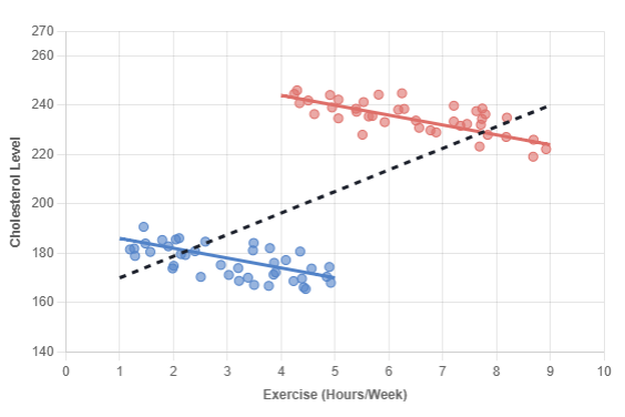
The Geometric Proof
The "Exercise Paradox"
A study measures Exercise (Hours/Week) vs. Cholesterol.
Without knowing the patients' ages, the data seems to show that exercise increases cholesterol.
↗ POSITIVE SLOPE
"More Exercise = Higher Cholesterol"
↘ NEGATIVE SLOPES
"More Exercise = Lower Cholesterol"
Implications for Modern Data Science
In the era of Big Data, Simpson's Paradox is more dangerous than ever before. Why? Because we rely on Dashboards and AI Aggregation.
Modern Business Intelligence (BI) tools like Tableau, PowerBI, and Looker are designed to aggregate. They default to SUM() and AVG(). They hide the granularity to make the chart "clean." By smoothing out the noise, they often smooth out the truth.
The "Ecological Fallacy"
Simpson's Paradox is closely related to the Ecological Fallacy: the mistake of assuming that what is true for a group is true for the individuals within that group.
How to Spot It in Your Business: As a data scientist or manager, your "Spidey Sense" should tingle whenever:
- Uneven Group Sizes: One group is massive (Department A), another is tiny (Department F).
- Different Base Rates: One group has a fundamentally different baseline (e.g., comparing "Mortality Rate" without separating "Hospice Care" from "Outpatient Care").
- The "Good News / Bad News" Split: A global KPI is Red (bad), but all your regional managers are reporting Green (good). This is the classic signature of the paradox.
Conclusion
Simpson's Paradox teaches us a humbling lesson: Data is not objective truth. Data is a description of a structure. If you ignore the structure (the departments, the age groups, the stone sizes), you will inevitably misunderstand the truth.
The next time you see a global average that contradicts your intuition, don't just accept it. Slice it. The truth is usually hiding in the subgroups.